Summary
Forget the old advice that white is the only way to make a small room feel bigger. I've found five fantastic paint colors, ranging from soft greens to muted pinks, that add depth, character, and even a sense of spaciousness to tiny apartments and condos. My top picks include Bay Paints Weathered Moss for a calm vibe and Benjamin Moore Abalone for sophisticated versatility, showing that color can truly transform your compact living area.
For years, the internet (and many designers) preached the same gospel for small spaces: paint it white. The idea was that white walls reflect the most light, making a room feel open and airy. And, sure, that's true to a point. But here's the thing: what if you can't stand white? What if you want your tiny apartment or cozy condo to actually have some personality?
I'm here to tell you that you absolutely don't have to default to white. In fact, I've found that midtone and even some darker colors can make a small space feel much bigger by adding depth and creating a wonderfully cozy, enveloping feel. It's all about picking the right shade and knowing how to work with it. We want color, people! I'm seeing a lot of you pushing back on the endless sea of neutrals, and I'm with you. Let's get some real color on those walls.
I've rounded up five fantastic paint colors from a few different companies that I think work wonders in smaller homes, whether you're in a city apartment or a compact townhouse. Not one of them is boring, safe, or sterile.
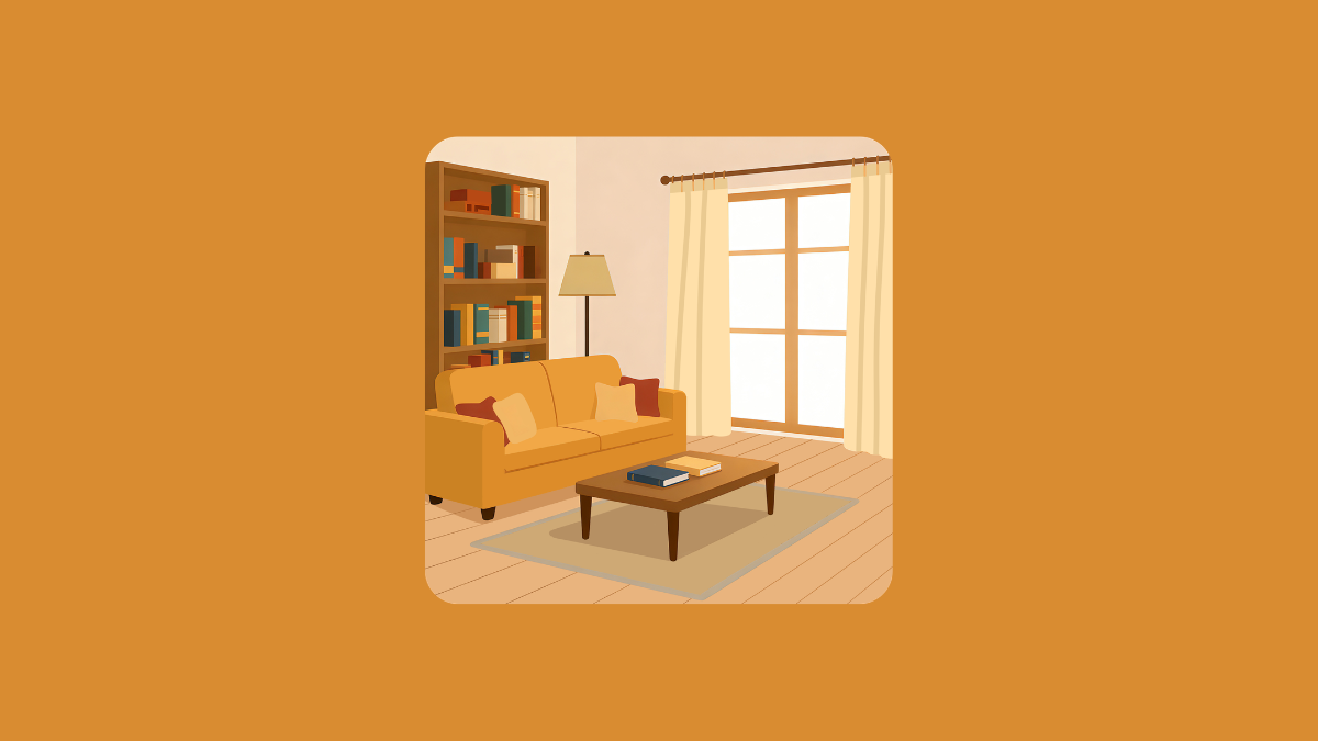
Bay Paints Weathered Moss: For Soft, Grounded Calm
If your space is begging for softness, Bay Paints Weathered Moss is a fantastic pick. It's a cool, whispery sage green that brings a real sense of calm and clarity without making a room feel drained or dull. It reflects enough light to keep things feeling airy, but it also has this subtle earthiness that grounds a room, making it feel more intentional and cohesive, even in spaces under 500 square feet.
I find this color works beautifully with Scandinavian, Japandi, and even modern farmhouse styles. Imagine it with light white oak furniture, soft linen textures, and a few brushed brass accents. It’s a modern green that whispers, never shouts. For trim, I like pairing it with bright whites for a crisp, fresh look, or slightly warmer creams if you want a cozier vibe.
Benjamin Moore Abalone: The Sophisticated Chameleon
Benjamin Moore's Abalone is a true color chameleon in the best possible way. It sits in that perfect sweet spot between a gray-beige, but with an almost imperceptible touch of lavender. This makes it an incredibly sophisticated backdrop that adds real dimension to small spaces.
What's cool about Abalone is how it changes with the light. It reads warm and cozy in lower light, then shifts to a slightly more ethereal feel during the day. It’s ideal for modern traditional, transitional, or minimalist interiors, especially if you're looking for something with a little edge but still very livable. I love pairing it with matte black fixtures for a striking contrast, or with taupe textiles and light woods to really emphasize its depth on the walls. This color helps open-concept apartments feel elevated without looking too formal or overdone.
Sherwin Williams Silver Strand: Ocean-Kissed Tranquility
If you're tired of the usual soft gray-blue, Sherwin Williams Silver Strand offers a cooler, more ocean-kissed alternative. It brings a gentle, spa-like tranquility to tight quarters while bouncing enough light around to keep the space feeling refreshed and open.
I think this color truly shines in coastal designs, modern farmhouse settings, or even industrial lofts. I used to live in a loft, and this would have been perfect. It comes alive even more when you pair it with raw materials like concrete or metal. Surprisingly, it also works really well with warm leathers and soft taupes, which help add a sense of balance to its cool tones. Unlike darker blues, Silver Strand gives you serenity without sacrificing that open, airy feel. It’s perfect if you want color and calm all at once.
Behr Smoky Pink: Muted Warmth and Unexpected Glow
If you've sworn off pink after seeing too many nurseries, let Behr Smoky Pink change your mind. This color is muted, refined, and incredibly versatile. It brings a soft glow to small rooms and adds just the right amount of warmth without overwhelming the visual space. Seriously, I'm trying to bring pink back!
I find this tone works especially well in eclectic, bohemian, or Parisian apartment styles. Imagine it with rattan furniture, vintage rugs, and finishes like marble or antique gold. It feels fresh and feminine, but also grounded and mature. I'd encourage you to use this color in bedrooms, reading nooks, or even as a feature wall in a small living area. It’s a delightful surprise, and it's for the person who wants something soft, but definitely not boring.
Benjamin Moore November Rain: The Ethereal Green-Gray
Benjamin Moore's November Rain is one of those colors that defies easy categorization – is it a pale green, a gray, or a beige? It’s all of those, and it has this almost foggy, ethereal quality that helps small spaces breathe without falling back on white.
This is my go-to paint color for organic modern, California casual, or even Wabi-sabi interiors. Pair it with muted wood tones, natural textiles, and round shapes to really let it do its thing. November Rain doesn’t dominate a space; it collaborates with it. It’s perfect for living rooms, home offices, bathrooms, or even a bedroom, like I did. Choose this if you want just a hint of color and softness without making a statement.
The Bottom Line
So, no, you don't have to default to white when decorating a small space. These five colors prove that tiny rooms can still have huge personality and feel wonderfully expansive, even while living in a fairly neutral landscape. Which one would you try first? I'm curious to see who's going for moody versus airy!


Comments
No comments yet — be the first.